Case study
November 2, 2025
5 days to rebuild user trust

Written by
David Pokorny
7
min read
A fast, focused redesign that turned a struggling landing page into a conversion-ready experience.
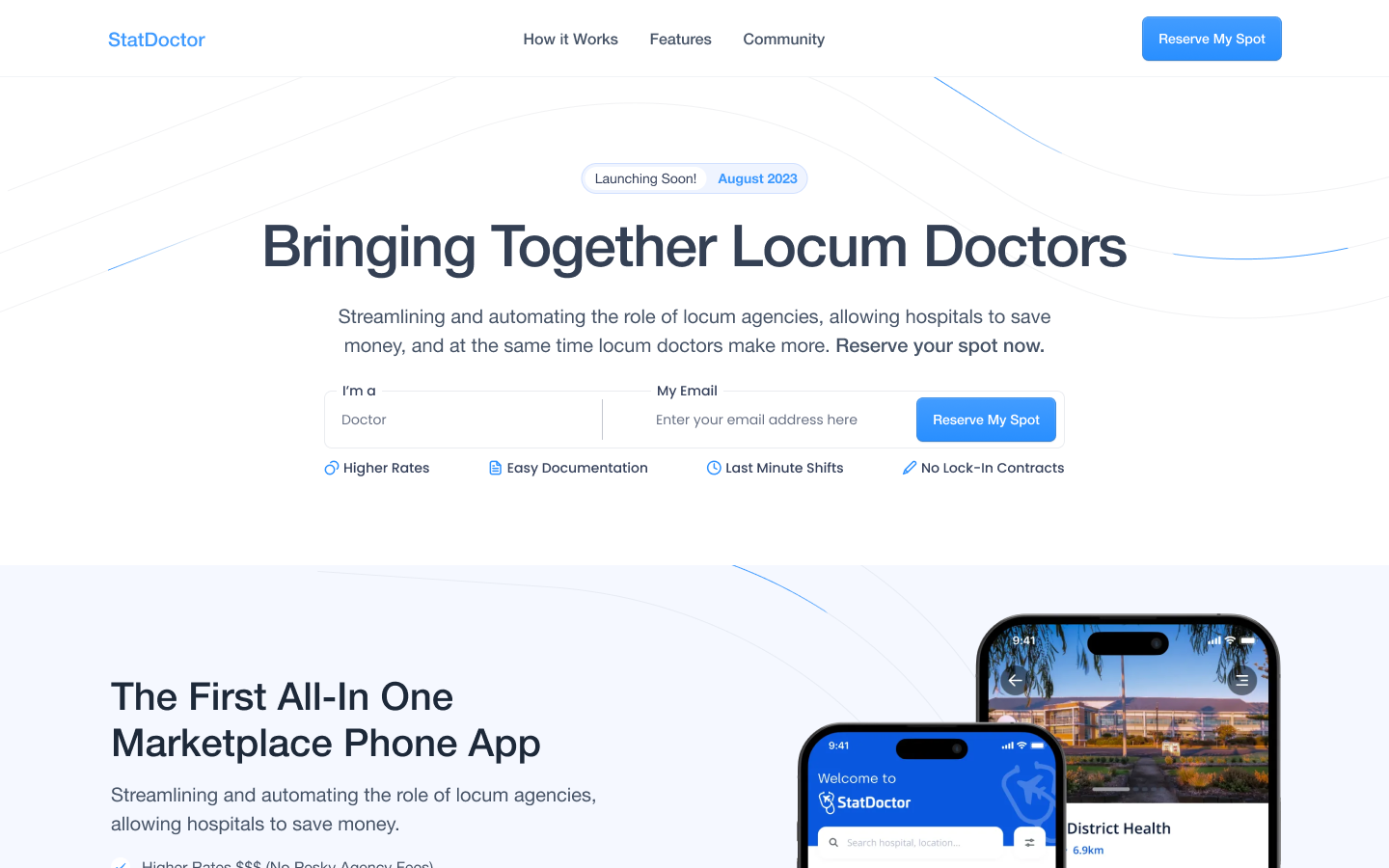
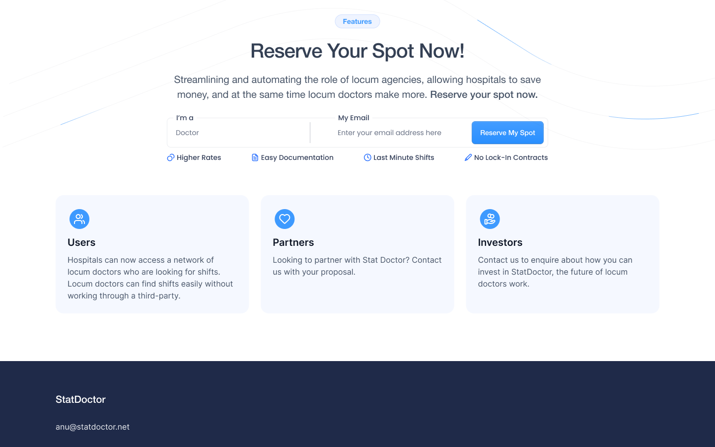
StatDoctor is a healthcare service that delivers quick, reliable medical consultations online. By connecting patients with expert doctors in real time, it makes healthcare more accessible, efficient, and convenient -- whether for routine checkups or specialized care.
The founders discovered Humbl Design through our free trial offer — a chance to see how fast great design can move. Their landing page was functional but underperforming. It lacked visual clarity, a clear hierarchy, and a logical user flow, leading visitors to drop off before taking action.
In less than a week, we turned that around.
The Problem
StatDoctor’s old landing page looked serviceable, but it didn’t convert.
The layout was text-heavy, visuals were generic, and the content hierarchy didn’t guide users toward action.
Visitors arrived curious and left confused. They didn’t understand the value proposition, didn’t know what to click, and rarely reached the booking form.
For a startup operating in the trust-dependent healthcare space, that was a major blocker.
The Approach -- Built on The Humbl Framework™
Even though this was a short 5-day sprint, we applied the same structure we use on larger projects — focus, clarity, and momentum.
H — Headstart
We kicked off immediately after a quick consultation call. No wasted time, no onboarding documents. Within hours, we had goals, structure, and early wireframes in progress.
U — Understand
We reviewed their existing site and mapped out where users were dropping off.
The insight was simple but powerful: people didn’t understand what StatDoctor actually offered.
We restructured the messaging around clarity and trust — leading with outcomes, not features.
M — Make
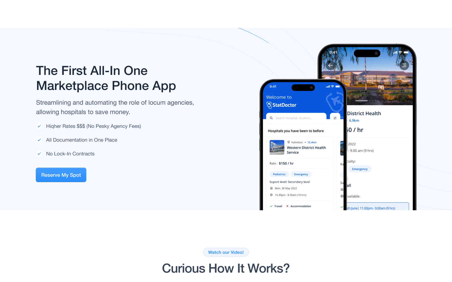
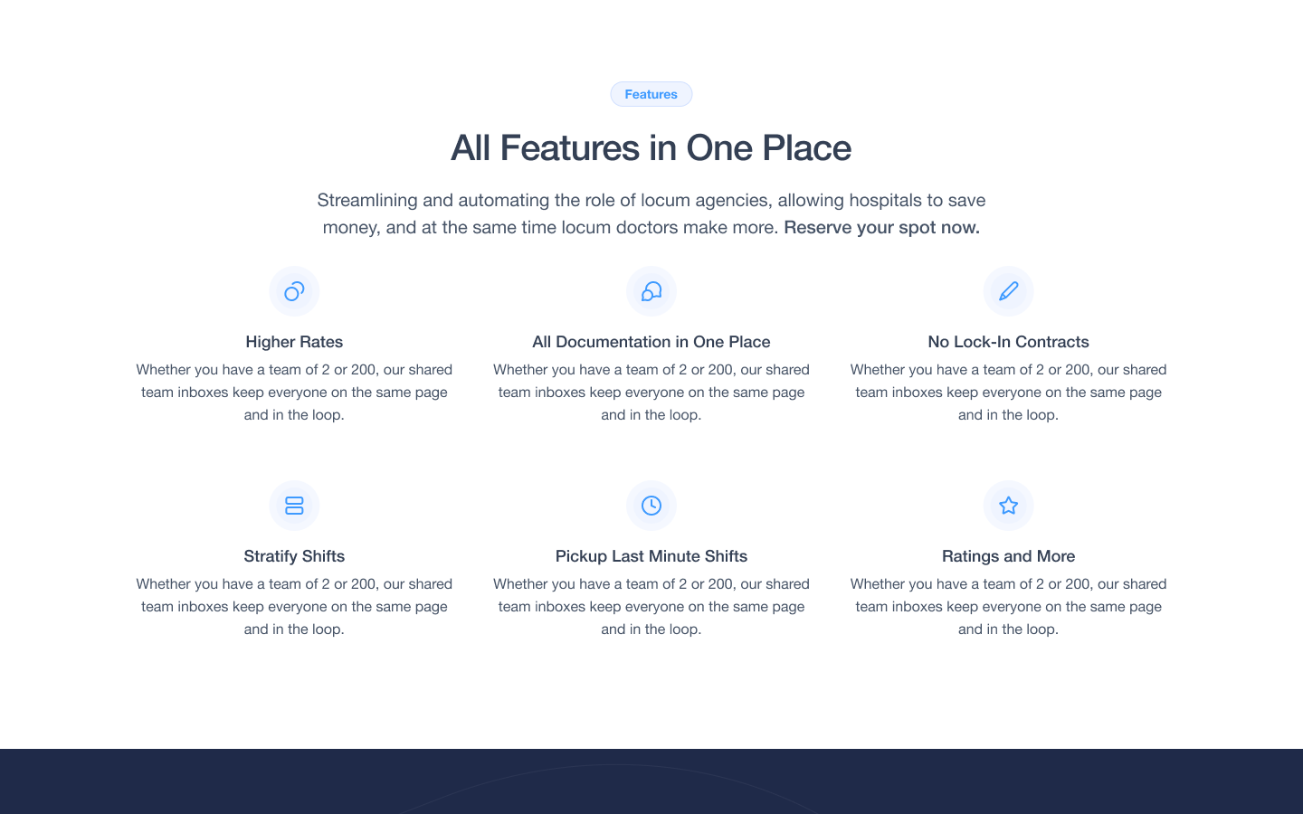
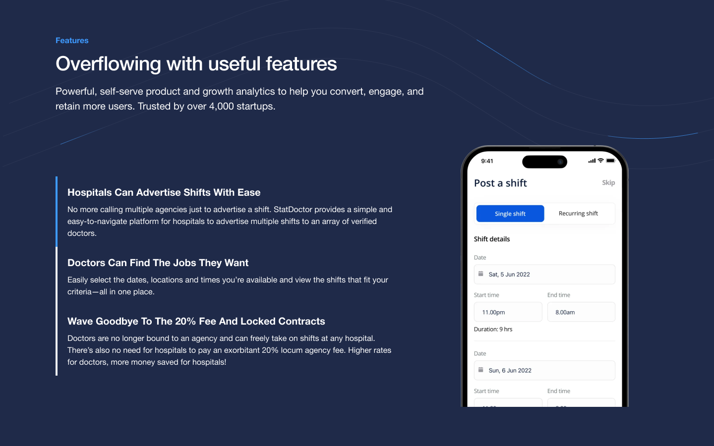
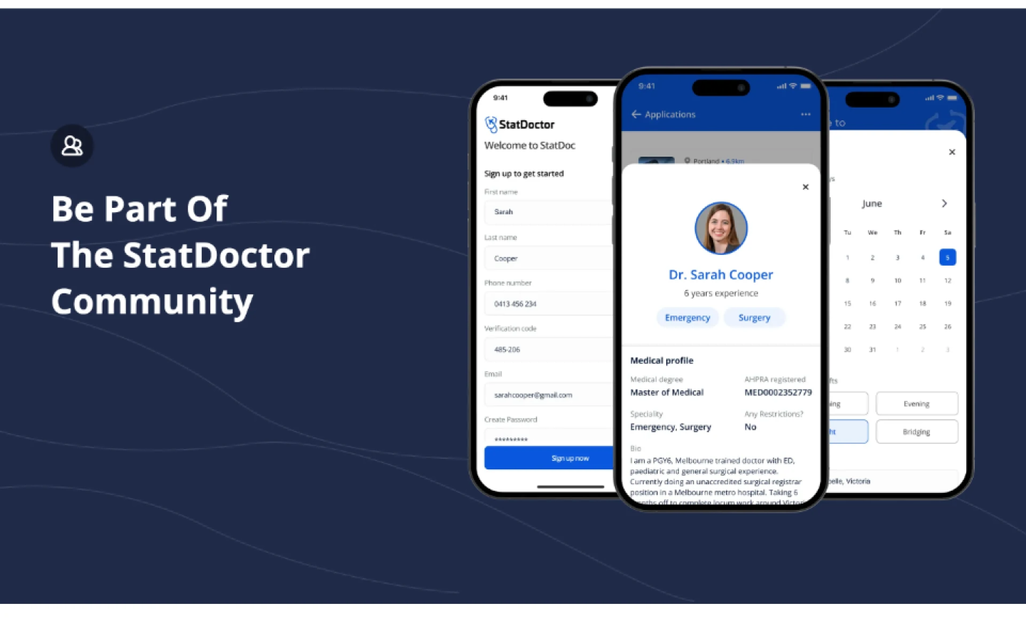
We created a new design system emphasizing approachability and credibility.
Clean visuals, professional typography, and focused copywriting replaced cluttered sections.
The page was designed to reassure visitors: “You’re in safe hands.”
B — Build
We moved directly from mockups to final assets, ensuring every section aligned with the founder’s tone and business goals.
No unnecessary revisions, no delays — everything built to launch fast.
L — Launch
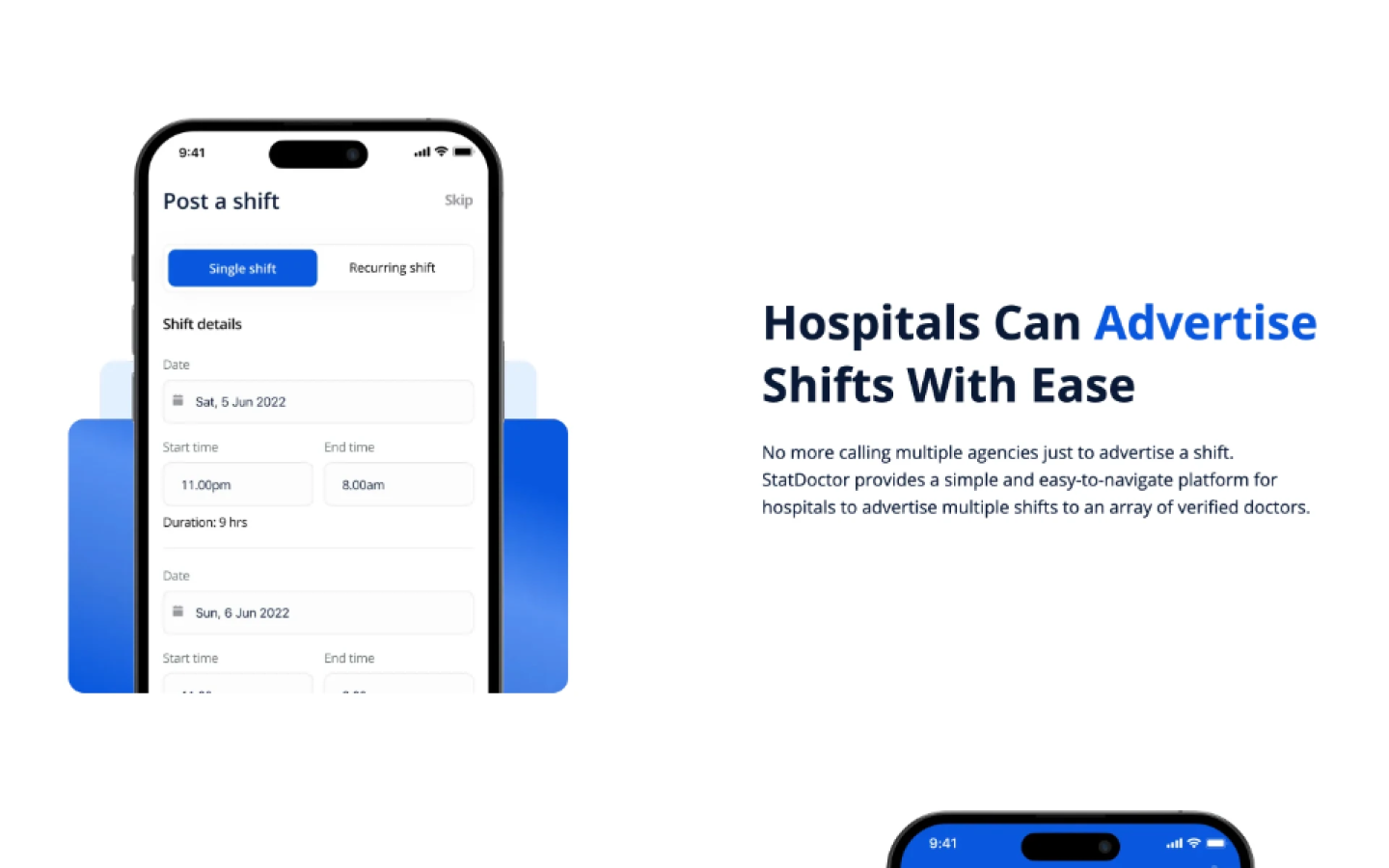
Within 5 days, StatDoctor had a new landing page live.
The redesign delivered structure, balance, and clear user flow — ready for investors, patients, and press.
The Results
✅ Landing page redesigned in 5 days
✅ Stronger visual hierarchy and user flow
✅ Increased clarity of value proposition
✅ Improved conversion readiness and brand credibility
Why It Worked
- Speed without shortcuts: A 5-day sprint driven by focus, not chaos.
- Clarity-driven design: Every section answered a single question — “Why StatDoctor?”
- Human tone: The new copy and visuals made the service feel accessible and trustworthy.
- Tight collaboration: Daily updates kept feedback fast and progress visible.
The Takeaway
StatDoctor’s story proves that sometimes, you don’t need months — you just need focus.
In under a week, Humbl Design transformed a confusing landing page into a confident, conversion-ready experience.
That’s the power of clear communication and founder-speed execution — the essence of The Humbl Framework™.
Word from the founder:
Before Humbl
Most founders struggle to get design that actually keeps up with their business.
They either go with freelancers who vanish when things get busy
or agencies that slow everything down with process, meetings, and ticket systems.

After Humbl
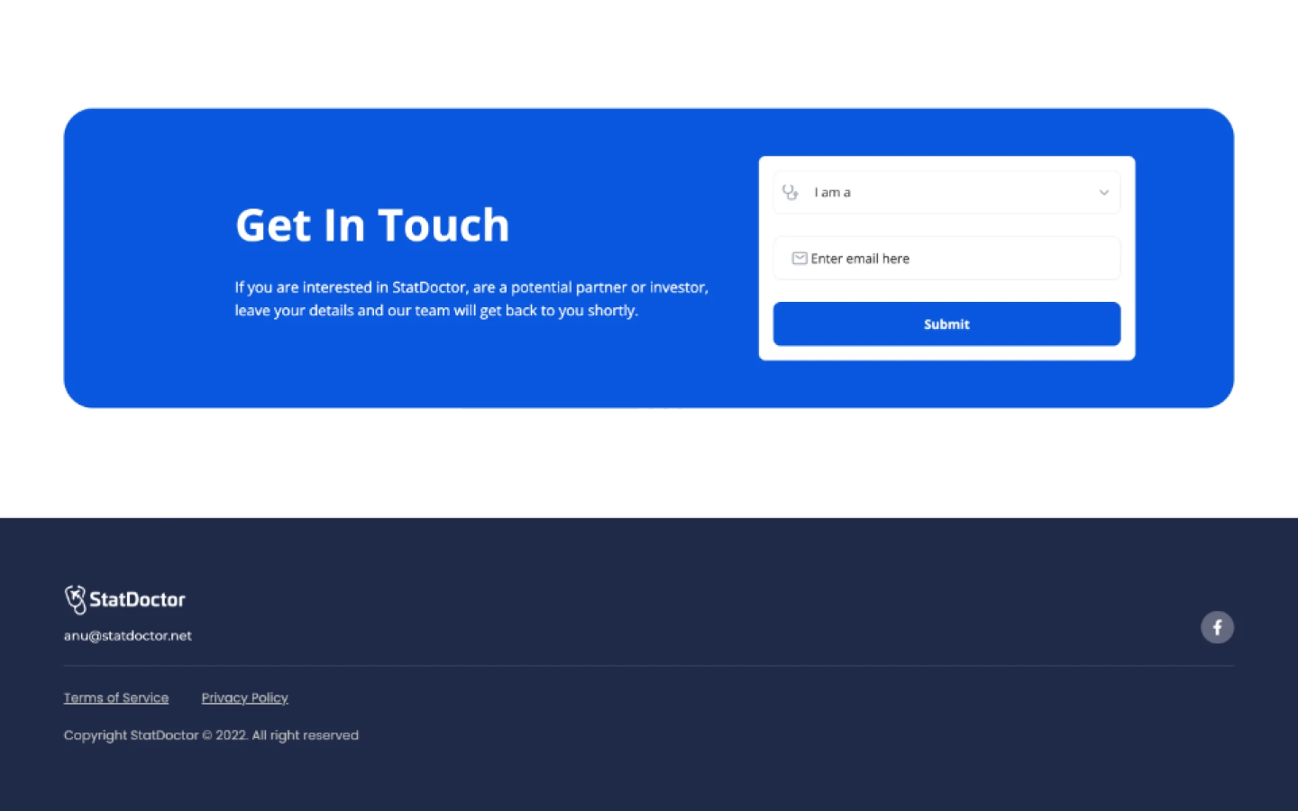
Sharing selected design work created by Humbl Design.
Some screens include early explorations, and all data shown is illustrative due to NDA restrictions.
