
Part 1: The technical build (the machine)
This is where the battle is won or lost. If you skip these steps, you will spend months fixing broken layouts later. We are building the engine before we paint the car.
Step 1: Secure the right infrastructure
Your first hurdle is the plan. As of Q1 2026, Webflow has streamlined their offering, but the "Basic" plan is a trap for early-stage startups. It lacks the CMS (Content Management System), which is the engine of your site.
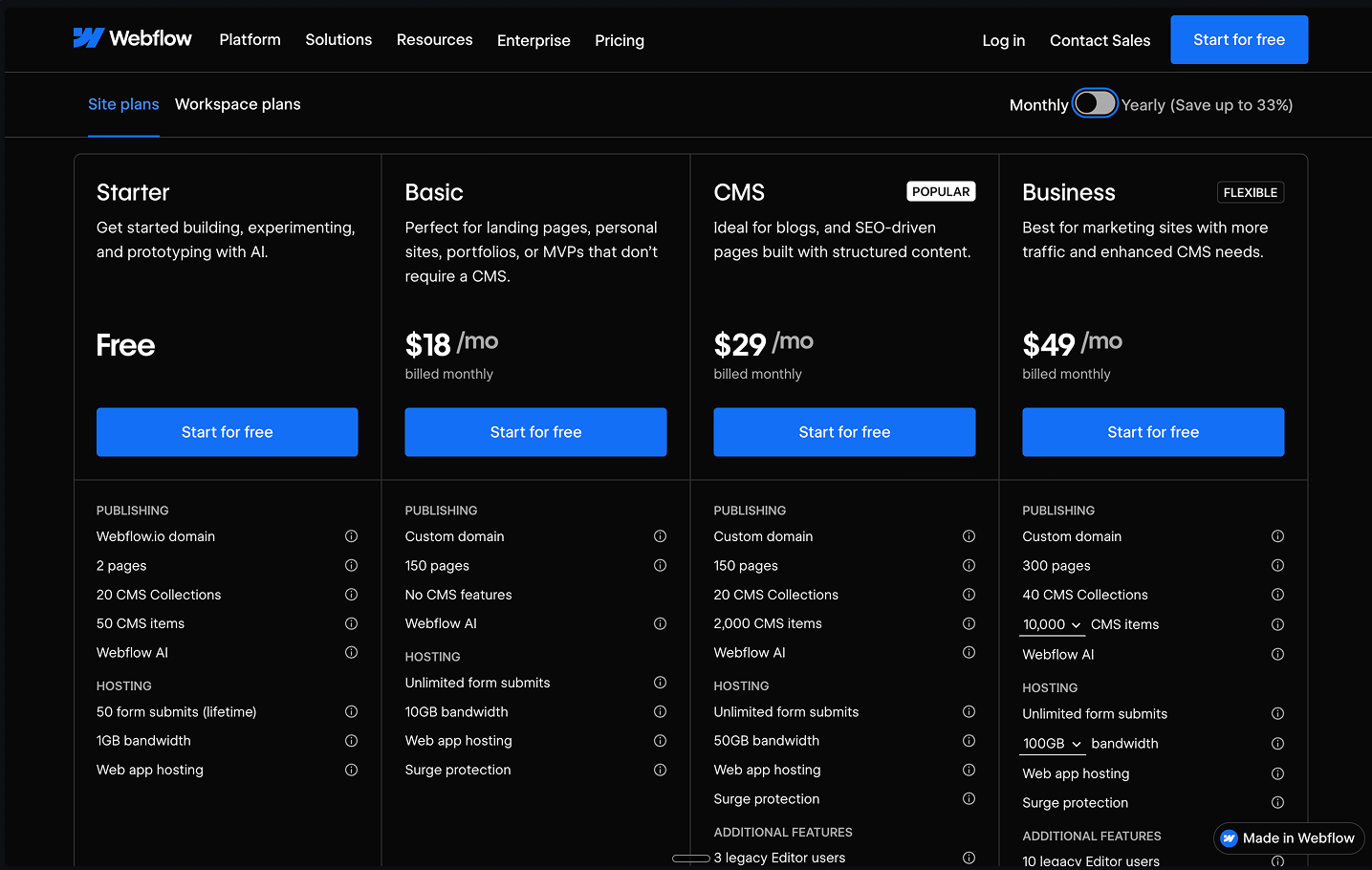
- CMS Plan ($29/mo): This is the floor. You need this for your blog, help center, team directory, and feature updates.
- Business Plan ($49/mo): Only upgrade if you hit 100k monthly visitors or need more than 10 content editors.
If you stick with the "Basic" plan to save money, you are creating technical debt. You will end up manually editing 20 different pages every time you want to update a single testimonial or change a team member's photo. The CMS plan allows you to build dynamic content structures, meaning you update a database item once, and it propagates globally across your entire site.
Step 2: Establish a naming convention
Webflow allows you to name your classes anything you want. This is dangerous. If you start styling "Div Block 1," "Div Block 2," and "Image 54," your site will become a nightmare to manage by week three.
You need a system. Use a simplified version of the "Client-First" system.
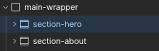
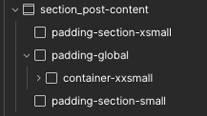
- Sections: Name your outer wrappers
section-[name](e.g.,section-hero,section-about). - Containers: Inside sections, use a standard container named
container-large. - Headings: Don't style the H1 tag directly on every page. Create utility classes like
heading-jumbo,heading-large, andheading-medium.
This keeps your code clean and legible. When you eventually hire a designer or developer, they will be able to read your class names and understand the structure immediately. It’s the difference between a professional kitchen and a messy dorm room.
Step 3: Build the global style guide
Before you build a page, you must define your "Global Styles." If you don't do this, you will have to manually set the font on every single text block, which is a waste of time.
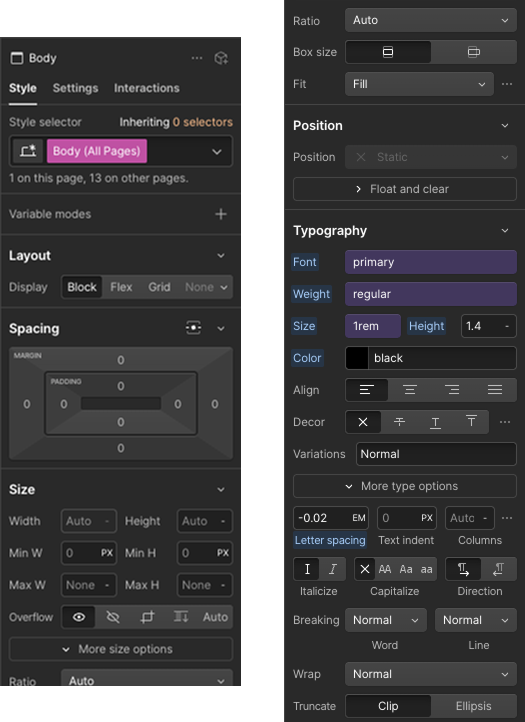
- Click on the canvas background.
- Go to the Style Selector (top right).
- Select the "Body (All Pages)" tag.
- Set your default Font Family (e.g., Inter), your default Font Size (1rem), and your default Font Color (Dark Grey, not pure Black).
Now, every time you drag a text element onto the screen, it will automatically inherit these settings. You just saved yourself hours of repetitive clicking.
Step 4: Build the CMS skeleton
Before you design a single pixel, build your data structure. Go to the CMS Collections tab (the database icon on the left) and create collections for "Blog Posts," "Case Studies," and "Team."
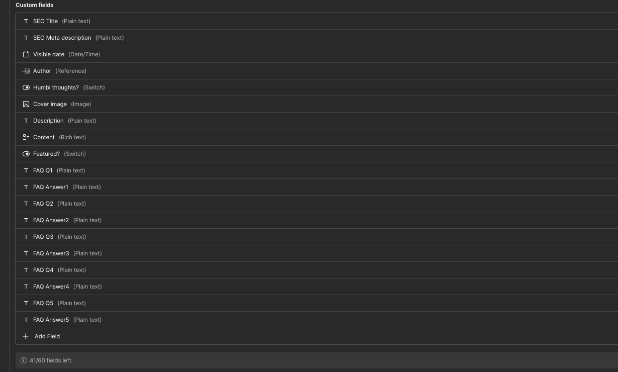
Define your fields carefully. For a "Blog Post," you need more than just a title and body. You need:
- Post Name (Plain Text)
- Post Body (Rich Text)
- Thumbnail (Image - Set validation to Max 500KB)
- SEO Title (Plain Text - limit to 60 chars)
- SEO Description (Plain Text - limit to 160 chars)
- Slug (Plain Text - automatically generated)
It is critical to include the SEO fields in the CMS structure right now. By creating specific fields for SEO titles and descriptions, you ensure that you can control exactly what Google displays for every single blog post, rather than letting the search engine pull random text from the page body.
Step 5: Constructing your pages (the hierarchy)
Now you build the actual layout. You must follow the "Box Model" hierarchy for every single page (Home, Pricing, About). This structure ensures your site behaves predictably on all screen sizes.
1. The Section (The wrapper)Press 'A' to open the elements panel. Drag a Section element onto the canvas.
- Settings: Set width to
100%. - Class: Name it
section-hero. - Tag: Go to the settings gear and change the HTML tag to
<section>. This helps Google understand your page structure.
2. The Container (The guardrails)Inside the Section, drag in a Div Block.
- Class: Name it
container-large. - Settings: Set a
max-width(usually80remor1280px). - Centering: Set left and right margins to
Auto. This ensures your content stays centered on big screens and doesn't stretch edge-to-edge.
3. The Layout (Grid vs. Flex)Inside the Container, you need to arrange your elements.
- Use Flexbox: For one-dimensional layouts (e.g., a row of buttons, or a hero section with text on the left and image on the right). Set the
container-largeor a specific wrapper toDisplay: Flex. - Use Grid: For two-dimensional layouts (e.g., a "bento box" feature section or a 3x2 gallery of team members). Drag a Grid element inside your container. Use a 12-column setup for professional alignment.
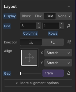
Using CSS Grid gives you significantly more control over how boxes resize and rearrange on mobile devices compared to legacy layout methods.
Step 6: Mastering responsiveness
In 2026, 70% of traffic is mobile. Your site must be "Mobile-Up." You design on Desktop, but you refine on Mobile.
- Use REM units: Set your font sizes in
REMinstead ofPX. If a user has their phone set to "Large Text," your site will scale naturally. 1rem usually equals 16px. - Stacking: On desktop, you have three items side-by-side (Flex Horizontal). Switch to the Mobile Portrait view. Change the Flex setting to Vertical. Now they stack perfectly.
- The Tap Test: Ensure every button is at least 44px tall. Fingers are fat; don't make users pinch-to-zoom to click "Buy."
Step 7: The speed audit
A slow site is a dead site. Large images are the number one reason startup websites fail Core Web Vitals. Go to the Assets panel. If you see PNG or JPG files, you need to optimize them.
- Export your images.
- Convert them to .webp. This is the 2026 standard.
- Re-upload.
- Check the "Lazy Load" checkbox in the image settings (except for the image in your Hero section—set that to "Eager").
Keep every image under 200KB to ensure instant load times. This is one of the easiest wins for SEO and user experience.
Step 8: Staging vs. production
Never publish "work in progress" to your main domain. Imagine a VC checking your site while you are mid-edit and the navigation bar is missing. Webflow gives you a .webflow.io staging domain.
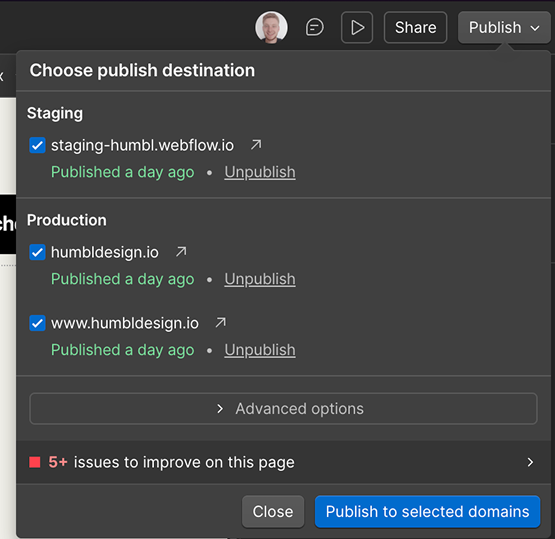
- Make edits.
- Publish to Staging.
- Test on your actual phone (not just the browser resize tool). Open the link in Safari and Chrome.
- Publish to Production only when perfect.
Part 2: Final SEO setup
You built the pages and the design. Now, make sure Google can actually read it.
SEO configuration and schema
Now that your pages are built and your CMS is ready, you need to connect the SEO dots.
For Static Pages (Home, Pricing):Go to the Pages panel. Click the gear icon next to "Home." Fill in the Title Tag (under 60 chars) and Meta Description (under 160 chars). Include your primary keyword near the start of the title.
For CMS Pages (Blog, Case Studies):
- Go to your Collection Page settings (e.g., Template for Blog Posts).
- Scroll down to the "SEO Settings" section.
- Do not type manually. Click the purple "+ Add Field" button next to the Title tag and select the "SEO Title" field you created in Step 4. Do the same for the Description.
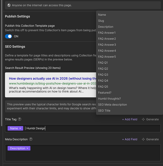
Next Level: Add Schema Markup.Go to the "Custom Code" section in the page settings (inside the <head> tag). Add a JSON-LD script that tells Google "This is a Blog Post" or "This is a Product." It helps you get those rich snippets (stars, pricing, author names) in search results.
Part 3: Quick tips, strategy & conversion
Now that the machine is built, you need to make it sell. A technically perfect site is useless if the messaging is boring or the design is ugly.
The conversion-first hero
Your hero section has 2.2 seconds to work. If the user has to scroll to understand what you do, you have lost them.
- The Catchy Title: Focus on the outcome, not the tech. Instead of "AI-Driven Analytics," say "Stop losing revenue to bad data."
- Social Proof: Put a "Trusted by" bar right under the CTA. Logos build trust faster than copy.
- One Strong CTA: Don't split their attention. Use "Start Free Trial." Make the button color pop against the background.
- Benefits vs. Features: Don't list specs. List the problems you solve.
The visual toolkit (steal like an artist)
You don't need a degree to look pro. You just need to stop guessing. Use these resources:
- Colors: Use Realtime Colors or Happy Hues. Pick a palette with high contrast (dark text, light background) and one "Action Color" like Indigo or Electric Blue. Use this action color only for buttons and links.
- Typography: Use Google Fonts. Stick to Inter, Outfit, or Plus Jakarta Sans. They are legible and modern. Limit yourself to two weights: Regular (400) for text and Bold (700) for headings.
- Imagery: Use Unsplash for abstract shots, but for SaaS, use Screenshots. Put your screenshot inside a nice browser frame (use a tool like Screely or shots.so). It makes the product feel tangible.
The invisible grid
Alignment is what separates amateurs from pros. Use a 12-column grid for your desktop layouts.
Drag a Grid element into your container and set it to 12 columns. Make your feature boxes span 4 columns each (for a row of 3). It ensures that your buttons, headers, and images all line up perfectly. It’s a subconscious signal to the user that this company is organized and trustworthy.
Favicon and Open Graph
Go to Project Settings > General.
- Favicon: Upload your logo (32x32). Do not leave the default Webflow icon; it looks lazy.
- Webclip: Upload a 256x256 version of your logo. This is what shows up if someone saves your site to their iPhone home screen.
- Open Graph: Go to page settings and upload an "OG Image." This is the picture that shows up when you share your link on LinkedIn or X/Twitter. If this is blank, no one will click your link.
Form logic & automation
Don't let leads sit in an inbox. Use Webflow Logic to connect your forms directly to your tools.
- Create a flow: When "Request Demo" is submitted -> Send to Slack "Sales" Channel -> Send Data to HubSpot.
- This happens instantly, allowing you to follow up while the lead is hot. You don't need Zapier for this anymore in 2026.
The expected outcome
If you followed these steps, you now have a Webflow site that loads in under 1.5 seconds, ranks for your keywords via dynamic SEO fields, and converts visitors with a clear, benefit-driven design. You have a scalable asset, not a digital liability.
Any statistics cited in this post come from third‑party studies and industry reports conducted under their own methodologies. They are intended to be directional, not guarantees of performance. Real outcomes will depend on your specific market, traffic quality, and execution.
How do I manage SEO for Webflow blog posts?
Create specific "SEO Title" and "SEO Description" plain text fields in your CMS collection. Then, in the Collection Template settings, bind these fields to the SEO Meta Title and Description sections to ensure every post is optimized uniquely.
What is the best font for a SaaS website in 2026?
Sans-serif fonts like Inter, Outfit, or Plus Jakarta Sans are the industry standard. They offer excellent readability on mobile devices and provide a clean, modern aesthetic that builds trust.
Why should I use Schema markup on my Webflow site?
Schema markup (JSON-LD) helps search engines understand your content better—identifying it explicitly as a "Product," "Article," or "FAQ." This increases the chance of getting rich snippets (like stars or prices) in Google search results.
What is the "Invisible Grid" in web design?
It is a 12-column layout structure used to align elements across the page. Using a grid ensures consistent spacing and alignment, making the website look professional and organized without requiring complex design skills.
How do I optimize images for Webflow?
Always convert images to .webp format before uploading. This format provides high quality at a fraction of the file size of PNGs. Aim to keep all images under 200KB to ensure your site loads instantly on mobile networks.
.png)


.png)